


News & Updates
3 Ways to Start Making Your Stuff Accessible Right Now
Want to start making your online materials more accessible, but don’t know where to start? Here are three simple ways you can incorporate accessible practices into your e-mails, documents and presentations.
1. Add alt-text to images
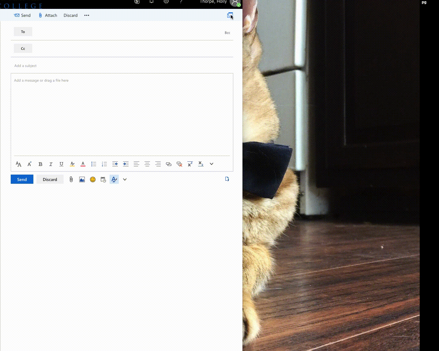
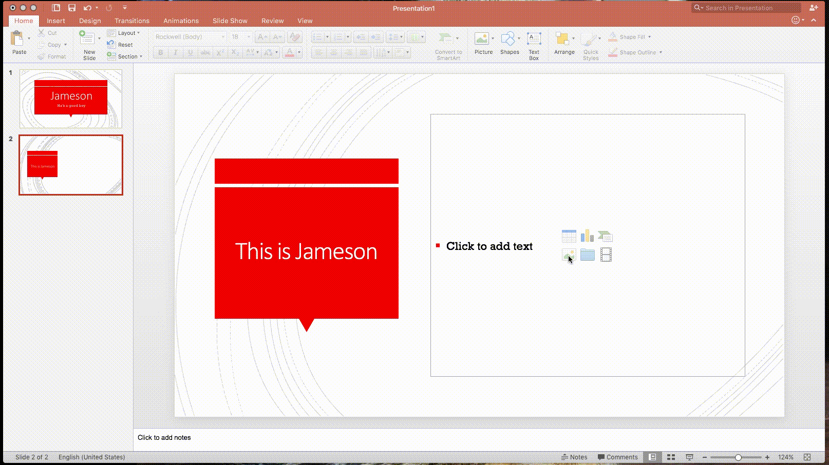
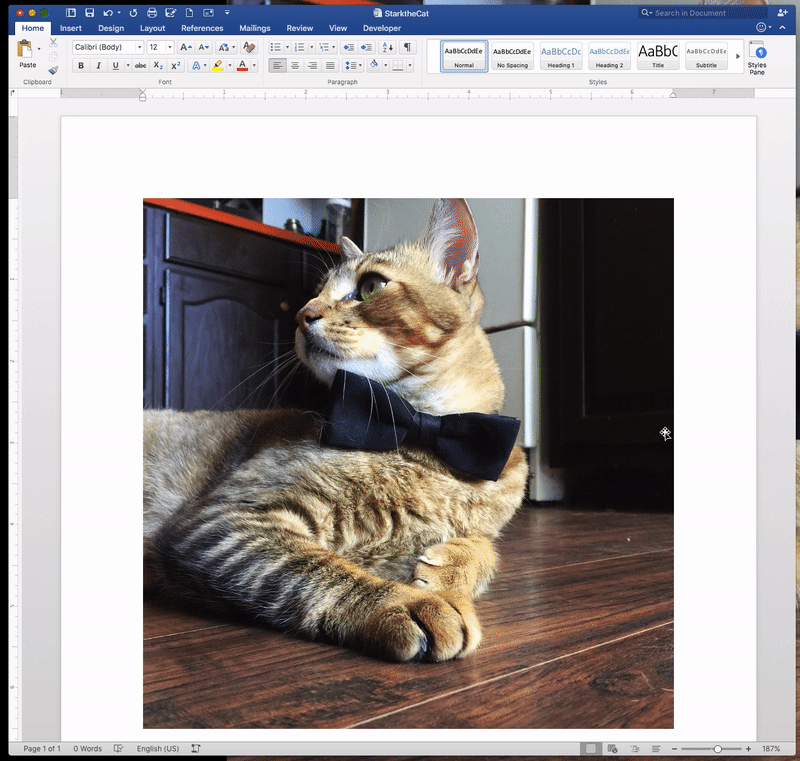
All images, including logos and informational images, need one thing: alternative text. Alternative text can be read by screen readers and will appear for readers if the image does not load. It is used so that whatever information is being conveyed by the image is still available to someone who cannot see it. In most Microsoft Office programs, you can right click and select “Format picture” and find the alt-text box under “Size & Properties” tab. Enter relevant information about the image in the alt-text box. If an image is strictly decorative, you may consider removing it. If you do keep it, you can insert a space (“ ”) in the alt-text box to instruct the screen reader to skip over the image. Below is gif showing the steps to add alt-text to an image in a Word document. View the gifs for Outlook web mail and PowerPoint.
2. Use descriptive hyperlinks
A descriptive hyperlink is a link in the form of descriptive text that gives the reader an idea of what they are clicking on and where it will take them. This is helpful for everyone, but it’s especially useful for those using screen readers. Screen readers will read the full URL if it’s pasted into a sentence. Here’s an example:
“Learn more about the Student Rec Center at https://www.wvc.edu/students/student-programs/rec-center.html”
becomes:
"Learn more on the Student Rec Center page."
That looks better for everyone and makes it easier for a screen reader to read the link. Use descriptive links everywhere, including documents, webpages and e-mails.
3. Use built-in formatting
Most programs you use on a day-to-day basis have built-in formatting options that can help make your stuff look good and are often accessible as well. Here are three of the most commonly used formatting tools:
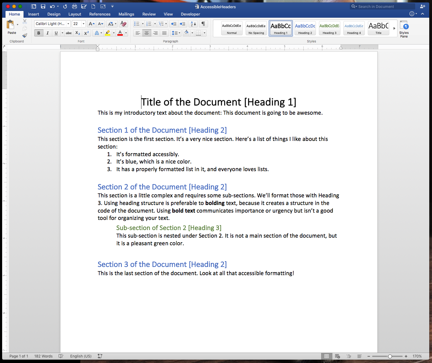
Headings
When a person using a screen reader views a document or e-mail with correctly ordered headings they can view the overall structure of the document and jump from section to section just as other users can. An added bonus: you can modify the style of the built-in headings easily, and the changes will be reflected everywhere you used the heading.
Lists
Use the built-in lists instead of formatting your own using dashes or other symbols. The list buttons are located at the top of most Microsoft Office programs, and allow you to customize how your list appears.
Columns
Don’t abuse your tab button or spacebar. Using those buttons to create columns is tedious and won’t be read correctly by screen readers. Instead, use the built-in columns formatting. The Columns button is found under the “Layout” tab at the top of your Word document. You can insert a column break (ending the text in one column and jumping to the next) under the "Breaks" button in the "Layout" tab.
You can find more tips for making your online materials accessible at wvc.edu/Accessibility. Need additional help? Contact the Accessible Technology team.
This post is part of our ongoing effort to make accessibility a priority at Wenatchee Valley College. Read more about the college’s commitment to accessible technology and get more tips for making your work accessible at wvc.edu/Accessibility.